
The Language of Color in Your Event
The Language of Color in Your Event and Its Impact on Attendees’ Feelings Through Your Printed Materials
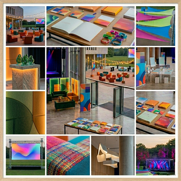
In the world of event and conference organization, the focus is often on lighting, sound quality, and speaker selection. However, there’s a subtle element that accompanies attendees from the moment they enter until they leave, an element they touch and their subconscious mind analyzes every second: the printed materials. More specifically, the colors that adorn these materials.
Choosing color for your event’s printed materials isn’t merely an aesthetic decision; it’s an investment in the “psychological engineering” of your guests. Color is the first message that reaches the brain. Before a visitor even reads a single word of the event brochure, the color has already signaled the nervous system to decide: Is this a trustworthy venue? A place for creativity? Or a formal and serious one?
The Psychology of Color: The Science Behind First Impressions
Colors possess a vibrational frequency that affects brain chemistry. When we choose the colors of printed materials (cards, brochures, signage), we are choosing the type of hormones we want to stimulate in our attendees.
Blue: A Haven of Trust and Stability
Blue is the “king of conferences.” In printed materials, it evokes a sense of spaciousness and tranquility. If your event is medical, technical, or financial, using shades of blue in attendee bags and handouts will lower your heart rate and convey a sense of authority. An attendee holding a dark blue brochure subconsciously perceives an expert and a level-headed person.
Red: The Adrenaline Catalyst
Red is the color of action. In event materials, it should be used sparingly. It’s great for product launches or sporting events. If you want attendees to take immediate action, such as “Scan the code to register now,” make that part red. But be careful; too much red in text-heavy printed materials can cause visual strain and an unwarranted sense of anxiety among attendees.
Green: The Language of Growth and Balance
Green is associated with health, the environment, and finances. In printed materials, it conveys a sense of security. It’s the perfect color for workshops focused on human development or events promoting sustainability. Using kraft paper with dark green printing sends a powerful message that your event is “eco-friendly” before you even have to explicitly state it.
Yellow and Orange: The Energy of Creativity and Welcome
These colors break the ice. If your event is a brainstorming session or a gathering of creatives and designers, prints with touches of orange encourage social interaction. Orange is a very “friendly” color, and using it on badges breaks down psychological barriers between strangers and encourages conversation.
Gradient Colors and Combating “Visual Boredom”
In recent years, prints have moved from flat colors to vibrant gradients. Psychologically, gradients mimic nature (like a sunset or the gradient of the sea), giving prints an “organic” feel that reduces the feeling of institutional rigidity.
A transition from cool to warm: Starting with blue at the top of the brochure and ending with purple at the bottom creates a sense of transition and growth. This tactic is excellent for event programs that begin with educational workshops (focus) and end with a dinner or cocktail party (social). Here, color guides the visitor’s mood chronologically with the day’s events.
The Language of Print in the “Attendee Journey”
Let’s imagine the visitor’s journey within the event and how colors influence their emotions at each stop:
Stop 1: Registration (Badge)
The badge is the visitor’s temporary “identity.” Its color determines their status and the type of feelings they evoke. Using light colors and soothing backgrounds reduces initial anxiety. If there is a segmentation of attendees (VIP, speakers, visitors), choosing a harmonious color palette instead of clashing colors makes the venue appear organized and professional.
Stop 2: The Event Brochure (Map and Schedule)
This is where deeper engagement begins. The color in the brochure must serve its function. Using cool colors behind long texts helps with focus. Remember that printed materials reflect light, so the color choice should consider the room’s lighting; a color that looks beautiful on your screen might appear dull or jarring under fluorescent light.
Station 3: Wayfinding
Colors are key here. Getting lost in the event space is a major source of stress. Using color coding in wayfinding materials (e.g., red room for training, blue room for lectures) makes visitors feel more in control and at ease, positively impacting their overall evaluation of the event.
Connecting Branding and Color Psychology
The biggest mistake organizers make is separating the company’s identity from the event’s theme.
- Visual Consistency: The colors in printed materials should be an extension of the company’s visual identity but with a touch that suits the event. If your company logo is black and gold, it’s a mistake to use pink and fluorescent event prints without a logical reason, as this creates “brand dissociation.”
- Communicating Values Through Color: If your brand promotes luxury, your prints should feature dark colors (royal black, navy) with metallic accents. Here, color doesn’t tell them who you are, but rather how valuable you are.
Texture and Color: The Forgotten Duality
In print, color isn’t just seen; it’s touched. The psychology of the audience is influenced by both the texture and color of the paper:
- Matte Colors: These convey a sense of modernity, sophistication, and authenticity. They are ideal for scientific and philosophical conferences.
- Glossy Colors: These evoke a sense of energy, speed, and commerce. They are perfect for fashion magazines or brochures for cars and consumer products.
- The “Rough Paper” Effect: When you print earthy colors on rough paper, you appeal to feelings of authenticity and connection to the earth.
Neon and Phosphorescent Colors
Neon colors have become popular in print materials for tech events and hackathons. Psychologically, these colors put the brain in a state of heightened alertness.
- Advantages: They convey a sense of futuristic, fast-paced, and artificial intelligence. They are great for attracting young people and small investors.
- Risks: If your audience consists of senior executives or older age groups, these colors can create visual noise, making them feel unserious or distracted. The key is to use them as accent colors on very dark backgrounds (black or navy) to highlight only the important details, such as the room number or the time of the keynote presentation.
Read also: Choosing the Right Print Materials for Events
Technical Tips to Ensure the Effectiveness of Your Psychological Message
To prevent colors from becoming a deterrent rather than an attraction, consider the following:
- The Rule of Contrast: Don’t sacrifice clarity for aesthetics. The text should be easily readable. Failure to read can create an immediate feeling of exclusion and frustration for the visitor.
- Lighting test: Request a printed proof and examine it under the same lighting conditions as the event. Warm colors (yellow, orange) may disappear completely under harsh yellow light.
- White space: Don’t try to fill every inch with color. White space (or color gaps) in printed materials gives the audience’s mind a “breathing room” and allows the eyes to rest, encouraging them to spend more time reading the content.
Conclusion: Printed materials as visual memory
At the end of the event, the attendee may forget what the speaker said at 3 o’clock, but they will take their “portfolio of printed materials” with them. These colorful items are what they will keep in their office or home. If you succeed in choosing colors that resonate with their emotions and are connected to your brand identity, you have transformed an ordinary piece of paper into a “psychological anchor” that reminds them of your event and their positive feelings about it every time they see it.
Colors in printed materials are not just decoration; they are a coded language. Master this language, and you will find that your audience responds to your event in ways you never imagined. A response that comes from both the heart and the mind.


Comments